-
CSS poiemaweb 2강~8강Javascript 2021. 5. 24. 20:19
어트리뷰트 셀렉터 (Attribute Selector)
~= : 공백으로 분리되고 지정된 어트리뷰트 값을 포함하는 요소를 선택한다.
|= : 지정된 어트리뷰트 값과 일치하거나 값 뒤에 -으로 시작하는 요소를 선택한다.
^= : 지정된 어트리뷰트 값으로 시작하는 요소를 선택한다.
$= " 지정된 어트리뷰트 값으로 끝나는 요소를 선택한다.
<!DOCTYPE html>
<html>
    <head>
        <style>
            h1[title~="first"] {
                color: blue;
            }
            h1[title|="second"] {
                color: pink;
            }
            a[href^="httpsL//"] {
                color: sienna;
            }
            a[href$="kr"] {
                font-size: 200%;
            }
            h1[title*="first"] {font-size:300%}
        </style>
    </head>
    <body>
        <h1 title="heading first">Heading first</h1>
        <h1 title="heading-first">Heading-first</h1>
        <h1 title="second">Heading second</h1>
        <h1 title="second-">Heading second-</h1>
        <a href="https://www.naver.com">네이버</a><br>
        <a href="https://www.google.co.kr">구글</a>
    </body>
</html>
출력 결과

3강 - 프로퍼티 값의 단위
크기단위
px
픽셀은 모니터 화소 1개의 크기를 의미한다. 따라서 해상도에 따라 px 크기가 달라진다.
그래서 대부분의 브라우저는 1px을 1/96인의 절대단위로 인식한다.
%
백분률 단위의 상대 단위로, 요소에 지정된 사이즈(상속된 사이즈나 디폴트 사이즈)에 상대적인 사이즈를 설정한다.
em
상대 단위로, 요소에 지정된 사이즈에 상대 사이즈를 설정한다.
예) 2em이면 상속된 사이즈나 디폴트 사이즈의 2배를 의미한다.
rem
em과의 차이점은 em은 상속의 영향으로 값이 바뀔 수 있지만 rem은 최상위 요소(html)의 사이즈만을 기준으로 한다.
Viewport 단위
vw - viewport 너비의 1/100
vh - viewport 높이의 1/100
vmin - viewport 너비 또는 높이 중 작은 쪽의 1/100
vmax - viewport 너비 도는 높이 중 큰 쪽의 1/100
색상 표현 단위
키워드 사용
red, blue, yellow 등
코드 사용
HEX 코드 - #000000
RGB (Red, Green, Blue) - rgb(255,255,0)
4강 - 박스 모델
Box Model
안에서부터 content,padding,border,margin 으로 구성되어 있다.
content: 텍스트나 이미지 등, 실제 내용이 위치하는 영역이다.
padding,border,margin은 그 위에 차곡차곡 쌓이는 공간이다. margin은 색을 지정할 수 없다.

poiemaweb.com content,padding,border,margin이 들어간 기본적인 박스 구조
<!DOCTYPE html>
<html>
    <head>
        <style>
            p {
                width: 300px;
                padding: 20px;
                background-color: pink;
                font-size: 10px;
                border: 10px solid red;
                margin: 20px;
            }
        </style>
    </head>
    <body>
        <h1>Box Model</h1><br>
        <p>This is a lightweight web service, (REST interface), which provides an easy way to access the YTS website.
            An API (Application programming interface) is a protocol intended to be used as an interface by software components to communicate with each other.
            Our API supports many methods, so there should not be a problem coding some nice applications. </p>
    </body>
</html>
출력 결과

width / height
요소의 너비와 높이를 지정할 때 사용된다.
box-sizing 프로퍼티는 기본값으로 content-box가 적용되어 일반적으로 콘텐츠 영역의 너비와 높이를 지정하게 되지만 box-sizing 값을 border-box로 변경하면 border까지 포함된 영역을 너비와 높이로 지정할 수 있다.
margin
콘텐츠의 상하좌우 margin값을 지정할 수 있다.
margin 값에 auto를 적절히 사용하면 해당 요소를 브라우저 중앙에 위치시킬 수 있다.
border
테두리 선의 스타일을 지정한다.
예) border: 5px solid red;
5강 - display, visibility, opacity
Display 프로퍼티 - layout 정의에 자주 사용된다.
1. block
항상 새로운 라인에서 시작한다.
화면 전체 가로폭을 차지한다.width:100%
width,height,margin,padding 사용 가능하다.
block 내에 inline 삽입 가능하다.
예)
- div
- h1~h6
- p
- ol
- ul
- li
- table
- form
적용 코드
<!DOCTYPE html>
<html>
    <head>
        <style>
            p:nth-of-type(1) {
            background-color: red;
            padding: 50px;
            margin: 30px;
            }
            p:nth-of-type(2) {
                background-color: orange;
                padding: 50px;
                margin: 30px;
                width: 300px;
            }
        </style>
    </head>
    <body>
        <p>This is paragraph 1 and much longer than 2.</p>
        <p>This is paragraph 2 and width is changed.</p>
    </body>
</html>
출력 결과
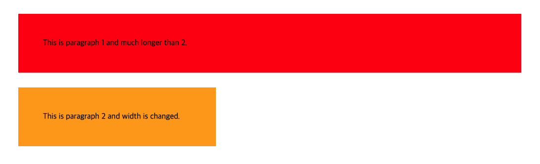
빨간색부분은 width가 주어지지 않았기 때문에 초기값 width:100%이고
주황색부분은 width:300px; 가 주어졌다.
2. inline
새로운 라인에서 시작하지 않고 문장 중간에 들어갈 수 있다.
content의 너비만큼 가로폭을 차지한다.
line-height로 상하여백을 조절하고 width,height,margin-top,margin-bottom 지정할 수 없다.
inline 뒤에 엔터,스페이스 등 공백이 있는 경우 space(4px)가 자동 지정된다.
inline 내에 block을 넣을 수 없다.
예)
- span
- a
- strong
- img
- br
- input
- select
- textarea
- button
적용 예
<!DOCTYPE html>
<html>
    <head>
        <style>
            div {
                font-size: 20px;

            }
            span {
                background-color: green;
                color: red;
                padding: 10px;
            }
        </style>
    </head>
    <body>
        <div>
            <h1>인라인 연습</h1>
            <p>this paragraph <span>is</span> very good.</p>
            <span>How</span>
            <span>Are</span><span>You?</span>
        </div>
    </body>
</html>
출력 결과

: 코드에서 How 이후 줄바꿈을 했기 때문에 결과에서 한번 space 되었다.
3. inline-block
inline의 한줄 표현이 가능하고 block의 width,height,margin 프로퍼티를 모두 지정 가능하다.
content의 너비만큼 가로폭을 차지한다.
적용예
<!DOCTYPE html>
<html>
    <head>
        <style>
            .inline-block {
                display: inline-block;
                border: 3px solid green;
                vertical-align:baseline;
            }
            .box1 {
                width: 300px;
                height: 70px;
            }
            .box2 {
                width: 300px;
                height: 150px;
            }
            .wrapped {
                font-size: 0px;
            }
        </style>
    </head>
    <body>
        <div class="inline-block box1">inline-block height 70px</div>
        <div class="inline-block box2">inline-block height 150px</div>

        <div class="wrapped">
            <div class="inline-block box1">inline-block height 70px</div>
            <div class="inline-block box2">inline-block height 150px</div>
        </div>
    </body>
</html>
block요소인 div에 display: inline-block을 적용해서 한줄에 연달아 올 수 있게 한다.
출력 결과

Visibility 프로퍼티 - 보이게 할 지 안 보이게 할 지 정의한다.
- visible: 보이게 한다.(기본값)
- hidden: 보이지 않게 한다. 보이지 않을 뿐이지 해당 요소는 공간을 점유하고 있다. display:none은 사라지게 한다.
- collapse: table 요소에 사용되며 행이나 열을 보이지 않게 한다.
opacity 프로퍼티 - 요소의 투명도를 정의한다. 0.0~1.0 사이의 값을 가진다.
6강 - Background
background-image: 요소에 배경 이미지를 지정한다.
background-repeat: 이미지 반복을 지정한다.
- 기본값이 repeat이고 설정된 이미지가 화면보다 작으면 화면을 다 채울 때 까지 이미지가 반복해서 출력된다.
- x축으로만 반복: repeat-x, y축으로만 반복: repeat-y, 반복 없애려면 no-repeat
background-size: 이미지 사이즈 지정 가능
- 값이 cover이면 이미지의 비율을 유지한 채로 부모요소의 너비, 높이 중 큰값에 이미지를 맞춘다.
- 값이 contain이면 이미지의 비율을 유지한 채로 부모요소 영역에 이미지 전체가 들어갈 수 있게 스케일을 조정하여 넣는다.
<style>
    h1:nth-of-type(1) {
        background-image: url("http://poiemaweb.com/img/bg/dot.png");
        background-repeat: repeat-x;
    }
    h1:nth-of-type(2) {
        background-image: url("http://poiemaweb.com/img/bg/dot.png");
        background-repeat: no-repeat;
    }
</style>
<body>
    <h1>image - repeat-x</h1>
    <h1>image -repeat-y</h1>
</body>
출력 결과

background-attachment
- 스크롤 할때 이미지는 스크롤 되지 않으려면 값으로 fixed 지정
<!DOCTYPE html>
<html>
<head>
  <style>
    *, *:after, *:before {
      margin: 0;
      padding: 0;
      box-sizing: border-box;
    }

    html, body {
      height: 100%;
      width: 100%;
    }

    .bg-wrap {
      min-height: 600px;
      height: 100%;
      background-size: cover;
      background-repeat: no-repeat;
      overflow: auto;
    }

    .parallax {
      background-image: url("http://poiemaweb.com/img/bg/stock-photo-125979219.jpg");
      background-attachment: fixed;
    }

    .normal {
      background-image: url("http://poiemaweb.com/img/bg/stock-photo-155153867.jpg");
    }

    #page-wrap {
      width: 400px;
      margin: 50px auto;
      padding: 30px;
      box-shadow: 0 0 20px black;
      font: 15px/2 Georgia, Serif;
      background-color: white;
    }

  </style>
</head>
<body>
  <div class="bg-wrap parallax">
    <div id="page-wrap">
      <p>Lorem ipsum dolor sit amet, consectetur adipisicing elit. Aliquid ipsum maxime libero, impedit necessitatibus quas blanditiis tenetur vero aut esse unde ab similique, delectus placeat enim quae expedita excepturi laboriosam.</p>
      <p>Lorem ipsum dolor sit amet, consectetur adipisicing elit. Aliquid ipsum maxime libero, impedit necessitatibus quas blanditiis tenetur vero aut esse unde ab similique, delectus placeat enim quae expedita excepturi laboriosam.</p>
      <p>Lorem ipsum dolor sit amet, consectetur adipisicing elit. Aliquid ipsum maxime libero, impedit necessitatibus quas blanditiis tenetur vero aut esse unde ab similique, delectus placeat enim quae expedita excepturi laboriosam.</p>
    </div>
  </div>
  <div class="bg-wrap normal"></div>
</body>
</html>
예제 문제 실습 결과 background-position
- 좌상단부터 이미지가 위치하며, 이미지의 좌표를 지정 가능하게 한다.
background shorthand
- color, image, repeat, position을 한번에 정의 가능하게 한다.
<style>
    div {
	background: #492F43 url("http://www.naver.com/images/image1.png") no-repeat center;
    }
</style>
7강 - 폰트(font)
font shorthand
- font-style, font-variant, font-weight, font-size, line-height, font-family 한번에 정의 가능하게 한다.
font: italic small-caps bolder 16px/3 cursive;line-height
- 텍스트의 높이를 지정한다.
- 텍스트 수직 정렬에 응용되어 사용된다.
<!DOCTYPE html>
<html>
    <head>
        <style>
            div {
                width: 200px;
                height: 80px;
                background-color: tomato;
                border-radius: 25px;
                box-shadow: 5x,5px,3px black;
            }
            div a {
                display: block;
                font: italic bold 2em/80px Arial, Helvetica, sans-serif;
                text-decoration:none;
                text-align: center;
            }
        </style>
    </head>
    <body>
        <div>
            <a href="#">Click</a>
        </div>
    </body>
</html>
출력 결과

: div의 높이가 80px이기 때문에 a의 line-heigh를 80px로 하여 수직 중앙 정렬을 했다.
8강 - Position(요소의 위치 정의)
1. position: static
- 기본값
- 자식이 static인 경우 부모 요소의 위치를 기준으로 배치된다.
- top, bottom, left, right 사용할 수 없다.
<!DOCTYPE html>
<html>
    <head>
        <style>
            body {
                margin: 0;
            }
            .parent {
                border: 1px solid black;
                width: 300px;
                height: 300px;
                position: absolute;
                top: 30px;
                left: 30px;
            }
            .static {
                color: red;
                background-color: navy;
                text-align: center;
                line-height: 300px;
                font-weight: bold;
            }
        </style>
    </head>
    <body>
        <div class="parent">
            <div class="static">static box</div>
        </div>
    </body>
</html>
출력 결과

2. position: relative
- static으로 지정되었을 때의 위치를 기준으로 좌표 프로퍼티를 사용하여 위치를 이동시킨다.
<!DOCTYPE html>
<html>
    <head>
        <style>
            .parent {
                margin: 30px;
                width: 300px;
                height: 300px;
                background-color: gray;
            }
            .relative-box {
                position:relative;
                background-color: black;
                top: 50px;
                left: 50px;
                color: green;
                text-align: center;
                line-height: 300px;

            }
        </style>
    </head>
    <body>
        <div class="parent">
            <div class="relative-box">
                relative-box
            </div>
        </div>
    </body>
</html>
출력 결과

3. position: absolute
- static이 아닌, 부모나 가장 가까이 있는 조상 요소를 기준으로 좌표 프로퍼티만큼 이동한다.
- 모두 static인 경우 body를 기준으로 이동한다.
- 다른 요소가 위치를 점유하고 있어도 더 앞쪽에 출력된다.
- absolute 선언 시, width가 content에 맞게 변하므로 적절한 width를 지정해야 한다.
<!DOCTYPE html>
<html>
    <head>
        <style>
            body {
                margin: 0;
            }
            .parent {
                width: 300px;
                height: 300px;
                background-color: yellow;
                border: 1px solid green;
                margin: 40px;
                float: left;
                position: static;
            }
            .absolute {
                position: absolute;
                width: 300px;
                top: 10px;
                left: 10px;
                height: 300px;
                background-color: black;
                text-align: center;
                line-height: 300px;
                color: red;
                font-size: 40px;
            }
            .relative {
                position: relative;
                top: 50px;
                left: 50px;
                background-color: black;
                text-align: center;
                line-height: 300px;
                color: red;
                font-size: 40px;
            }
        </style>
    </head>
    <body>
        <div class="parent">
            <div class="absolute">absolute box</div>
        </div>
        <div class="parent">
            <div class="relative">relative box</div>
        </div>
    </body>
</html>
출력 결과

4. position: fixed
- 부모 요소와 관계 없이 브라우저의 viewport를 기준으로 좌표 프로퍼티로 이동시킨다.
- 스크롤이 되도 화면에 고정되어 있는다.
- width가 content에 맞게 변하므로 적절한 width를 지정해야 한다.
<!DOCTYPE html>
<html>
    <head>
        <style>
            body {
                margin: 0;
            }
            .side-bar {
                position:fixed;
                width: 50px;
                height: 100%;
                right: 0px;
                color: red;
                background-color: darkslategrey;
                text-align:center;
                padding-top: 100px;
            }
            .footer {
                position: fixed;
                width: 100vw;
                height: 70px;
                color: red;
                text-align: center;
                line-height: 70px;
                background-color: darkslategrey;
                bottom: 0px;
            }
        </style>
    </head>
    <body>
        <div class="side-bar">fixed box(side-bar)</div>
        <div class="footer">fixed box(footer)</div>
    </body>
</html>
출력 결과

z-index
- 큰 숫자값을 가질 수록 화면 앞쪽에 출력된다. position: static이 아닌 요소에만 적용된다.
<!DOCTYPE html>
<html>
    <head>
        <style>
            body {
                margin: 0;
            }
            .box1 {
                width: 100px;
                height: 100px;
                background-color: orange;
                position: static;
            }
            .box2 {
                position:absolute;
                width: 110px;
                height: 70px;
                background-color: red;
                left: 50px;
                top: 50px;
                z-index: 2;
            }
            .box3 {
                position: absolute;
                width: 50px;
                height: 25px;
                background-color: green;
                z-index: 3;
                left: 100px;
                top: 100px;
            }
        </style>
    </head>
    <body>
        <div class="box1"></div>
        <div class="box2"></div>
        <div class="box3"></div>
    </body>
</html>
출력 결과

overflow: 자식 요소가 부모 요소의 영역을 벗어났을 때 처리 방법
- visible: 벗어난 부분을 표시한다.(기본값)
- hidden: 잘라낸다.
- scroll: 스크롤을 표시한다.(벗어난 부분이 없어도 생긴다.)
- auto: 벗어난 부분이 있을 때만 스크롤 표시한다.
- overflow-y, overflow-x: 특정 방향으로만 스크롤 표시하고 싶을 때 사용한다.
'Javascript' 카테고리의 다른 글
Javascript 객체, 함수 (0) 2021.05.27 구글 UI 클론 코딩-2 (0) 2021.05.26 CSS 9강 Float , 구글 UI 클론코딩 (0) 2021.05.25 HTML 복습 및 CSS 공부 시작 (0) 2021.05.23 HTML 기초 학습 (0) 2021.05.22